Basics
This guide will cover the fundamentals of the Slint Language. It’s a simple language that is easy to learn and use. It’s also a language that is very powerful and can be used to create any type of UI.
The first part covers the basic syntax
Text { text: "Hello World"; color: blue;}Here we declared a Text element with a text property and a color property.

Here we reused the Button component from the standard widget library and gave it a custom label.
The next part covers the basic primitives the Slint language provides for drawing rectangles, images and text. There are a lot more than those, but once you understand how to use these you already understand the majority of how all components are built.
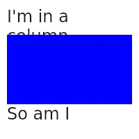
The next part will cover how to layout elements and nest them. Which is as simple as:
VerticalLayout { padding: 10px; Text { text: "I'm in a column"; font-size: 24px; } Rectangle { height: 100px; background: blue; } Text { text: "So am I"; font-size: 24px; }}
The next part covers bindings.
The next part covers states.
The next part covers animations.
The next part covers the basics of the Slint language. It covers the basics of how to declare elements and components, how to declare identifiers and how to use them.
component MyApp {    Text {        text: "Hello World";        font-size: 24px;    }}
The final part covers how the Slint UI and the business logic communicate with each other.
