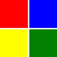
GridLayout
// This example uses the `Row` elementexport component Foo inherits Window { width: 200px; height: 200px; GridLayout { spacing: 5px; Row { Rectangle { background: red; } Rectangle { background: blue; } } Row { Rectangle { background: yellow; } Rectangle { background: green; } } }}
// This example uses the `col` and `row` propertiesexport component Foo inherits Window { width: 200px; height: 150px; GridLayout { Rectangle { background: red; } Rectangle { background: blue; } Rectangle { background: yellow; row: 1; } Rectangle { background: green; } Rectangle { background: black; col: 2; row: 0; } }}
GridLayout places elements on a grid.
GridLayout covers its entire surface with cells. Cells are not aligned. The elements constituting the cells will be stretched inside their allocated space, unless their size constraints—like, e.g., min-height or max-width—work against this.
Spacing properties
spacing
type: length
default: 0px
The distance between the elements in the layout. This single value is applied to both horizontal and vertical spacing.
To target specific axis with different values use the following properties:
spacing-horizontal
type: length
default: 0px
spacing-vertical
type: length
default: 0px
Padding properties
padding
type: length
default: 0px
The padding around the grid structure as a whole. This single value is applied to all sides.
To target specific sides with different values use the following properties:
padding-left
type: length
default: 0px
padding-right
type: length
default: 0px
padding-top
type: length
default: 0px
padding-bottom
type: length
default: 0px
Cell elements
Cell elements inside a GridLayout obtain the following new properties. Any bindings to these properties must be compile-time constants:
row
type: int
default: 0
The index of the element’s row within the grid. Setting this property resets the element’s column to zero, unless explicitly set.
col
type: int
default: 0
The index of the element’s column within the grid. Set this property to override the sequential column assignment (e.g., to skip a column).
rowspan
type: int
default: 1
The number of rows this element should span.
colspan
type: int
default: 1
The number of columns this element should span.
To implicitly sequentially assign row indices—just like with col—wrap cell elements in Row elements.
The following example creates a 2-by-2 grid with Row elements, omitting one cell:
import { Button } from "std-widgets.slint";export component Foo inherits Window { width: 200px; height: 100px; GridLayout { Row { // children implicitly on row 0 Button { col: 1; text: "Top Right"; } // implicit column after this would be 2 } Row { // children implicitly on row 1 Button { text: "Bottom Left"; } // implicitly in column 0... Button { text: "Bottom Right"; } // ...and 1 } }}The following example creates the same grid using the row property. Row indices must be taken care of manually:
import { Button } from "std-widgets.slint";export component Foo inherits Window { width: 200px; height: 100px; GridLayout { Button { row: 0; col: 1; text: "Top Right"; } // `row: 0;` could even be left out at the start Button { row: 1; text: "Bottom Left"; } // new row, implicitly resets column to 0 Button { text: "Bottom Right"; } // same row, sequentially assigned column 1 }}
