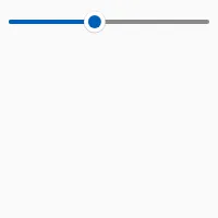
Slider
import { Slider,  VerticalBox } from "std-widgets.slint";export component Example inherits Window {    width: 200px;    height: 40px;
    VerticalBox {        alignment: center;
        Slider {            value: 42;        }    }}
slint
Properties
Section titled “Properties”enabled
Section titled “enabled” bool default: true
You can’t interact with the slider if enabled is false.
has-focus
Section titled “has-focus” bool (out) default: false
Set to true when the slider currently has the focus
minimum
Section titled “minimum”maximum
Section titled “maximum”orientation
Section titled “orientation” enum Orientation default: horizontal
Orientation
Represents the orientation of an element or widget such as the Slider.
horizontal: Element is oriented horizontally.vertical: Element is oriented vertically.
If set to true the Slider is displayed vertical.
Callbacks
Section titled “Callbacks”changed(float)
Section titled “changed(float)”The value was changed
Slider { changed(value) => { debug("New value: ", value); }}slint
released(float)
Section titled “released(float)”Invoked when the user completed changing the slider’s value, i.e. when the press on the knob was released or the arrow keys lifted.
Slider { released(position) => { debug("Released at position: ", position); }}slint
© 2025 SixtyFPS GmbH