Text
// text-example.slintexport component TextExample inherits Window {    // Text colored red.    Text {        x:0; y:0;        text: "Hello World";        color: red;    }
// This paragraph breaks into multiple lines of text. Text { x:0; y: 30px; text: "This paragraph breaks into multiple lines of text"; wrap: word-wrap; width: 150px; height: 100%; }}A Text element for displaying text.
If the width and height properties are not set, the text will
be expand in a single line. If the wrap property is set along with
a width and height, the text will be wrapped into multiple lines
of text.
Properties
Section titled “Properties” brush default: <depends on theme>
The color of the text.
Text { text: "Hello"; color: #3586f4; font-size: 40pt;}
font-family
Section titled “font-family” string default: ""
The name of the font family selected for rendering the text.
Text { text: "CoMiC!"; color: black; font-size: 40pt; font-family: "Comic Sans MS";}
font-size
Section titled “font-size” length default: 0px
The font size of the text.
Text { text: "Big"; color: black; font-size: 70pt;}
font-weight
Section titled “font-weight” int default: 0
The weight of the font. The values range from 100 (lightest) to 900 (thickest). 400 is the normal weight.
Text { text: "BOLD"; color: black; font-size: 30pt; font-weight: 800;}
font-italic
Section titled “font-italic” bool default: false
Whether or not the font face should be drawn italicized or not.
Text { text: "Italic"; color: black; font-italic: true; font-size: 40pt;}
font-metrics
Section titled “font-metrics” struct FontMetrics default: a struct with all default values
FontMetrics
A structure to hold metrics of a font for a specified pixel size.
ascent(length): The distance between the baseline and the top of the tallest glyph in the font.descent(length): The distance between the baseline and the bottom of the tallest glyph in the font. This is usually negative.x_height(length): The distance between the baseline and the horizontal midpoint of the tallest glyph in the font, or zero if not specified by the font.cap_height(length): The distance between the baseline and the top of a regular upper-case glyph in the font, or zero if not specified by the font.
The design metrics of the font scaled to the font pixel size used by the element.
horizontal-alignment
Section titled “horizontal-alignment” enum TextHorizontalAlignment default: the first enum value
TextHorizontalAlignment
This enum describes the different types of alignment of text along the horizontal axis of a Text element.
left: The text will be aligned with the left edge of the containing box.center: The text will be horizontally centered within the containing box.right: The text will be aligned to the right of the containing box.
Text { x: 0; text: "Hello"; color: black; font-size: 40pt; horizontal-alignment: left;}
letter-spacing
Section titled “letter-spacing” length default: 0px
The letter spacing allows changing the spacing between the glyphs. A positive value increases the spacing and a negative value decreases the distance.
Text { text: "Spaced!"; color: black; font-size: 30pt; letter-spacing: 4px;}
overflow
Section titled “overflow” enum TextOverflow default: the first enum value
TextOverflow
This enum describes the how the text appear if it is too wide to fit in the Text width.
clip: The text will simply be clipped.elide: The text will be elided with….
string default: ""
The text rendered.
vertical-alignment
Section titled “vertical-alignment” enum TextVerticalAlignment default: the first enum value
TextVerticalAlignment
This enum describes the different types of alignment of text along the vertical axis of a Text element.
top: The text will be aligned to the top of the containing box.center: The text will be vertically centered within the containing box.bottom: The text will be aligned to the bottom of the containing box.
enum TextWrap default: the first enum value
TextWrap
This enum describes the how the text wrap if it is too wide to fit in the Text width.
no-wrap: The text won’t wrap, but instead will overflow.word-wrap: The text will be wrapped at word boundaries if possible, or at any location for very long words.char-wrap: The text will be wrapped at any character. Currently only supported by the Qt and Software renderers.
Text { text: "This paragraph breaks into multiple lines of text"; font-size: 20pt; wrap: word-wrap; width: 180px;}
stroke
Section titled “stroke” brush default: a transparent brush
The brush used for the text outline.
Text { text: "Stroke"; stroke-width: 2px; stroke: darkblue; stroke-style: center; font-size: 80px; color: lightblue;}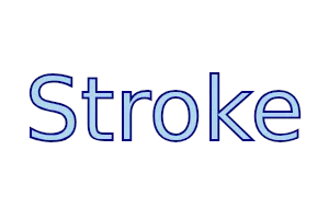
stroke-width
Section titled “stroke-width” length default: 0px
The width of the text outline. If the width is zero, then a hairline stroke (1 physical pixel) will be rendered.
stroke-style
Section titled “stroke-style” enum TextStrokeStyle default: the first enum value
TextStrokeStyle
This enum describes the positioning of a text stroke relative to the border of the glyphs in a Text.
outside: The inside edge of the stroke is at the outer edge of the text.center: The center line of the stroke is at the outer edge of the text, like in Adobe Illustrator.
Text { text: "Style"; stroke-width: 2px; stroke: #3586f4; stroke-style: center; font-size: 60px; color: white;}
Rotation
Section titled “Rotation”Rotates the text by the given angle around the specified origin point. The default origin point is the center of the element.
Text { text: "I'm dizzy"; rotation-angle: 45deg; rotation-origin-x: self.width / 2; rotation-origin-y: self.height / 2; font-size: 30pt;}
rotation-angle
Section titled “rotation-angle” angle default: 0deg
rotation-origin-x
Section titled “rotation-origin-x” length default: 0px
rotation-origin-y
Section titled “rotation-origin-y” length default: 0px
Accessibility
Section titled “Accessibility”By default, Text elements have the following accessibility properties set:
accessible-role: text;accessible-label: text;
© 2025 SixtyFPS GmbH