Rectangle
By default, a Rectangle is just an empty item that shows nothing. By setting a color or configuring a border,
it’s then possible to draw a rectangle on the screen.
When not part of a layout, its width and height default to 100% of the parent element.
export component ExampleRectangle inherits Window {    width: 200px; height: 800px; background: transparent;
    Rectangle {        x: 10px; y: 10px;        width: 180px;        height: 180px;        background: #315afd;    }
    // Rectangle with a border    Rectangle {        x: 10px; y: 210px;        width: 180px;        height: 180px;        background: green;        border-width: 2px;        border-color: red;    }
    // Transparent Rectangle with a border and a radius    Rectangle {        x: 10px; y: 410px;        width: 180px;        height: 180px;        border-width: 4px;        border-color: black;        border-radius: 30px;    }
    // A radius of width/2 makes it a circle    Rectangle {        x: 10px; y: 610px;        width: 180px;        height: 180px;        background: yellow;        border-width: 2px;        border-color: blue;        border-radius: self.width/2;    }}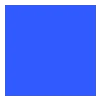
Properties
Section titled “Properties”background
Section titled “background” brush default: transparent
The background brush of this Rectangle.
property <brush> rainbow-gradient: @linear-gradient(40deg, rgba(255, 0, 0, 1) 0%, rgba(255, 154, 0, 1) 10%, rgba(208, 222, 33, 1) 20%,rgba(79, 220, 74, 1) 30%, rgba(63, 218, 216, 1) 40%, rgba(47, 201, 226, 1) 50%, rgba(28, 127, 238, 1) 60%, rgba(95, 21, 242, 1) 70%, rgba(186, 12, 248, 1) 80%, rgba(251, 7, 217, 1) 90%, rgba(255, 0, 0, 1) 100%);
Rectangle {    x: 10px;    y: 10px;    width: 180px;    height: 180px;    background: #315afd;}

Rectangle {    x: 10px;    y: 210px;    width: 180px;    height: 180px;    background: rainbow-gradient;}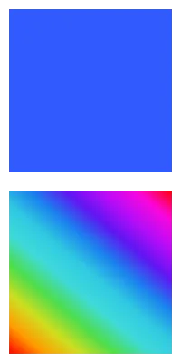
border-color
Section titled “border-color” brush default: transparent
Rectangle { width: 200px; height: 200px; border-width: 10px; border-color: lightslategray;}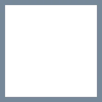
The color of the border.
border-width
Section titled “border-width” length default: 0
Rectangle { width: 200px; height: 200px; border-width: 30px; border-color: lightslategray;}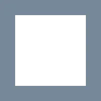
The width of the border.
bool default: false
// clip: false; the defaultRectangle {    x: 50px; y: 50px;    width: 150px;    height: 150px;    background: darkslategray;    Rectangle {        x: -40px; y: -40px;        width: 100px;        height: 100px;        background: lightslategray;    }}
// clip: true; Clips the children of this RectangleRectangle {    x: 50px; y: 250px;    width: 150px;    height: 150px;    background: darkslategray;    clip: true;    Rectangle {        x: -40px; y: -40px;        width: 100px;        height: 100px;        background: lightslategray;    }}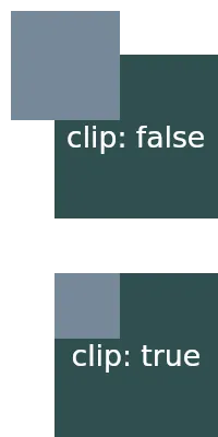
By default, when child elements are outside the bounds of a parent,
they are still shown. When this property is set to true, the children
of this Rectangle are clipped and only the contents inside the elements bounds are shown.
Border Radius Properties
Section titled “Border Radius Properties”border-radius
Section titled “border-radius” length default: 0
The size of the radius. This single value is applied to all four corners.
To target specific corners with different values use the following properties:
border-top-left-radius
Section titled “border-top-left-radius” length default: 0px
border-top-right-radius
Section titled “border-top-right-radius” length default: 0px
border-bottom-left-radius
Section titled “border-bottom-left-radius” length default: 0px
border-bottom-right-radius
Section titled “border-bottom-right-radius”Drop Shadows
Section titled “Drop Shadows”To achieve the graphical effect of a visually elevated shape that shows a shadow effect underneath the frame of
an element, it’s possible to set the following drop-shadow properties:
drop-shadow-blur
Section titled “drop-shadow-blur” length default: 0px
The radius of the shadow that also describes the level of blur applied to the shadow. Negative values are ignored and zero means no blur.
drop-shadow-color
Section titled “drop-shadow-color” color default: a transparent color
The base color of the shadow to use. Typically that color is the starting color of a gradient that fades into transparency.
drop-shadow-offset-x
Section titled “drop-shadow-offset-x” length default: 0px
The horizontal distance of the shadow from the element’s frame.
drop-shadow-offset-y
Section titled “drop-shadow-offset-y” length default: 0px
The vertical distance of the shadow from the element’s frame.
© 2025 SixtyFPS GmbH