Positioning and Layouts
All visual elements are shown in a window. The x and y properties store
the elements coordinates relative to their parent element. Slint determines the
absolute position of an element by adding the parent’s position to
the element’s position. If the parent has a parent element itself, then that one
is added as well. This calculation continues until the top-level element
is reached.
The width and height properties store the size of visual elements.
You can create an entire graphical user interface by placing the elements in two ways:
- Explicitly - by setting the
x,y,width, andheightproperties. - Automatically - by using layout elements.
Explicit placement is great for static scenes with few elements. Layouts are suitable for complex user interfaces and help create scalable user interfaces. Layout elements express geometric relationships between elements.
Explicit Placement
Section titled “Explicit Placement”The following example places two rectangles into a window, a blue one and a green one. The green rectangle is a child of the blue:
// Explicit positioningexport component Example inherits Window { width: 200px; height: 200px; Rectangle { x: 100px; y: 70px; width: parent.width - self.x; height: parent.height - self.y; background: blue; Rectangle { x: 10px; y: 5px; width: 50px; height: 30px; background: green; } }}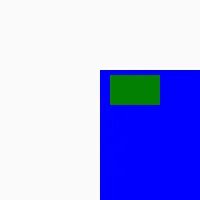
The positions of both rectangles and the size of the inner green one are fixed.
The outer blue rectangle has a size that’s automatically calculated using binding
expressions for the width and height properties. The calculation results in the
bottom left corner aligning with the corner of the window - it updates whenever
the width and height of the window changes.
When specifying explicit values for any of the geometric properties, Slint requires you to attach a unit to the number. You can choose between two different units:
- Logical pixels, using the
pxunit suffix. This is the recommended unit. - Physical pixels, using the
phxunit suffix
Logical pixels scale automatically with the device pixel ratio that your system is configured with. For example, on a modern High-DPI display the device pixel ratio can be 2, so every logical pixel occupies 2 physical pixels. On an older screen the user interface scales without any adaptations.
You can also specify the width and height properties as a % percentage
unit, which applies relative to the parent element. For example a width: 50% means half
of the parent’s width.
The default values for x and y properties center elements within their
parent.
The default values for width and height depend on the type of element. Elements such as Image,
Text, as well as most widgets are sized automatically based on their content. The following elements
don’t have content and default to fill their parent element when they do not have children:
RectangleTouchAreaFocusScopeFlickable
Layouts are also defaulting to fill the parent, regardless of their own preferred size.
Other elements (including custom ones without base) default to using their preferred size.
Preferred Size
Section titled “Preferred Size”You can specify the preferred size of elements with the preferred-width and preferred-height properties.
When not explicitly set, the preferred size depends on the children, and is the preferred size of the
child that has the bigger preferred size, whose x and y property are not set.
The preferred size is therefore computed from the child to the parent, just like other constraints (maximum and minimum size), unless explicitly overwritten.
A special case is to set the preferred size to be the size of the parent using 100% as value.
For example, this component uses the size of the parent by default:
export component MyComponent { preferred-width: 100%; preferred-height: 100%; // ...}Automatic Placement Using Layouts
Section titled “Automatic Placement Using Layouts”Slint comes with different layout elements that automatically calculate the position and size of their children:
VerticalLayout/HorizontalLayout: The children are placed along the vertical or horizontal axis.GridLayout: The children are placed in a grid of columns and rows.
You can also nest layouts to create complex user interfaces.
You can tune the automatic placement using different constraints, to accommodate the design of your user interface. Each element has a minimum, a maximum size, and a preferred size. Set these explicitly using the following properties:
min-widthmin-heightmax-widthmax-heightpreferred-widthpreferred-height
Any element with a specified width and height has a fixed size in a layout.
When there is extra space in a layout, elements can stretch along the layout axis. You can control this stretch factor between the element and its siblings with these properties:
horizontal-stretchvertical-stretch
A value of 0 means that the element won’t stretch at all. All elements stretch
equally if they all have a stretch factor of 0.
The default value of these constraint properties may depends on the content of the element.
If the element’s x or y isn’t set, these constraints are also automatically
applied to the parent element.
Common Properties on Layout Elements
Section titled “Common Properties on Layout Elements”All layout elements have the following properties in common:
spacing: This controls the spacing between the children.padding: This specifies the padding within the layout, the space between the elements and the border of the layout.
For more fine grained control, you can split the padding property into properties for each side of the layout:
padding-leftpadding-rightpadding-toppadding-bottom
VerticalLayout and HorizontalLayout
Section titled “VerticalLayout and HorizontalLayout”The VerticalLayout and HorizontalLayout elements place their children in a
column or a row. By default, they stretch or shrink to take the whole space. You
can adjust the element’s alignment as needed.
The following example places the blue and yellow rectangle in a row and evenly stretched
across the 200 logical pixels of width:
// Stretch by defaultexport component Example inherits Window { width: 200px; height: 200px; HorizontalLayout { Rectangle { background: blue; min-width: 20px; } Rectangle { background: yellow; min-width: 30px; } }}
The example below, on the other hand, specifies that the rectangles align to the start of the layout (the visual left). That results in no stretching but instead the rectangles retain their specified minimum width:
// Unless an alignment is specifiedexport component Example inherits Window { width: 200px; height: 200px; HorizontalLayout { alignment: start; Rectangle { background: blue; min-width: 20px; } Rectangle { background: yellow; min-width: 30px; } }}
The example below nests two layouts for a more complex scene:
export component Example inherits Window {    width: 200px;    height: 200px;    HorizontalLayout {        // Side panel        Rectangle { background: green; width: 10px; }
        VerticalLayout {            padding: 0px;            //toolbar            Rectangle { background: blue; height: 7px; }
            Rectangle {                border-color: red; border-width: 2px;                HorizontalLayout {                    Rectangle { border-color: blue; border-width: 2px; }                    Rectangle { border-color: green; border-width: 2px; }                }            }            Rectangle {                border-color: orange; border-width: 2px;                HorizontalLayout {                    Rectangle { border-color: black; border-width: 2px; }                    Rectangle { border-color: pink; border-width: 2px; }                }            }        }    }}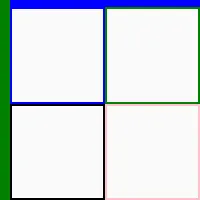
Relative Lengths
Section titled “Relative Lengths”Sometimes it’s convenient to express the relationships of length properties in terms of relative percentages. For example the following inner blue rectangle has half the size of the outer green window:
export component Example inherits Window {    preferred-width: 100px;    preferred-height: 100px;
background: green; Rectangle { background: blue; width: parent.width * 50%; height: parent.height * 50%; }}This pattern of expressing the width or height in percent of the parent’s property with the same name is
common. For convenience, a short-hand syntax exists for this scenario:
- The property is
widthorheight - A binding expression evaluates to a percentage.
If these conditions are met, then it’s not necessary to specify the parent property, instead you can simply use the percentage. The earlier example then looks like this:
export component Example inherits Window {    preferred-width: 100px;    preferred-height: 100px;
background: green; Rectangle { background: blue; width: 50%; height: 50%; }}Alignment
Section titled “Alignment”Each element is sized according to their width or height if specified, otherwise it’s
set to the minimum size which is set with the min-width or min-height property, or
the minimum size of an inner layout, whatever is bigger.
The elements are placed according to the alignment. The size of elements
is bigger than the minimum size only if the alignment property of the layout is LayoutAlignment.stretch (the default)
This example show the different alignment possibilities:
export component Example inherits Window { width: 300px; height: 200px; VerticalLayout { HorizontalLayout { alignment: stretch; Text { text: "stretch (default)"; } Rectangle { background: blue; min-width: 20px; } Rectangle { background: yellow; min-width: 30px; } } HorizontalLayout { alignment: start; Text { text: "start"; } Rectangle { background: blue; min-width: 20px; } Rectangle { background: yellow; min-width: 30px; } } HorizontalLayout { alignment: end; Text { text: "end"; } Rectangle { background: blue; min-width: 20px; } Rectangle { background: yellow; min-width: 30px; } } HorizontalLayout { alignment: start; Text { text: "start"; } Rectangle { background: blue; min-width: 20px; } Rectangle { background: yellow; min-width: 30px; } } HorizontalLayout { alignment: center; Text { text: "center"; } Rectangle { background: blue; min-width: 20px; } Rectangle { background: yellow; min-width: 30px; } } HorizontalLayout { alignment: space-between; Text { text: "space-between"; } Rectangle { background: blue; min-width: 20px; } Rectangle { background: yellow; min-width: 30px; } } HorizontalLayout { alignment: space-around; Text { text: "space-around"; } Rectangle { background: blue; min-width: 20px; } Rectangle { background: yellow; min-width: 30px; } } }}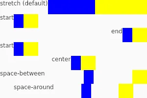
Stretch algorithm
Section titled “Stretch algorithm”When the alignment is set to stretch (the default), the elements are sized to their minimum size,
then the extra space is shared amongst element proportional to their stretch factor set with the
horizontal-stretch and vertical-stretch properties. The stretched size won’t exceed the maximum size.
The stretch factor is a floating point number. The elements that have a default content size usually defaults to 0
while elements that default to the size of their parents defaults to 1.
An element of a stretch factor of 0 keep its minimum size, unless all the other elements also have a stretch
factor of 0 or reached their maximum size.
Examples:
export component Example inherits Window { width: 300px; height: 200px; VerticalLayout { // Same stretch factor (1 by default): the size is divided equally HorizontalLayout { Rectangle { background: blue; } Rectangle { background: yellow;} Rectangle { background: green;} } // Elements with a bigger min-width are given a bigger size before they expand HorizontalLayout { Rectangle { background: cyan; min-width: 100px;} Rectangle { background: magenta; min-width: 50px;} Rectangle { background: gold;} } // Stretch factor twice as big: grows twice as much HorizontalLayout { Rectangle { background: navy; horizontal-stretch: 2;} Rectangle { background: gray; } } // All elements not having a maximum width have a stretch factor of 0 so they grow HorizontalLayout { Rectangle { background: red; max-width: 20px; } Rectangle { background: orange; horizontal-stretch: 0; } Rectangle { background: pink; horizontal-stretch: 0; } } }}
The VerticalLayout and HorizontalLayout can also contain for or if expressions:
export component Example inherits Window { width: 200px; height: 50px; HorizontalLayout { Rectangle { background: green; } for t in [ "Hello", "World", "!" ] : Text { text: t; } Rectangle { background: blue; } }}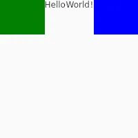
GridLayout
Section titled “GridLayout”The GridLayout lays the element in a grid.
Each element gains the properties row, col, rowspan, and colspan.
You can either use a Row sub-element, or set the row property explicitly.
These properties must be statically known at compile time, so it’s impossible
to use arithmetic or depend on properties. As of now, the use of for or if
isn’t allowed in a grid layout.
This example use the Row element
export component Foo inherits Window { width: 200px; height: 200px; GridLayout { spacing: 5px; Row { Rectangle { background: red; } Rectangle { background: blue; } } Row { Rectangle { background: yellow; } Rectangle { background: green; } } }}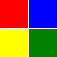
This example use the col and row property:
export component Foo inherits Window { width: 200px; height: 150px; GridLayout { spacing: 0px; Rectangle { background: red; } Rectangle { background: blue; } Rectangle { background: yellow; row: 1; } Rectangle { background: green; } Rectangle { background: black; col: 2; row: 0; } }}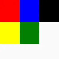
Container Components (@children)
Section titled “Container Components (@children)”When creating components, it’s sometimes useful to influence where child elements are placed when used. For example, a component that draws a label above an element inside:
export component MyApp inherits Window {
    BoxWithLabel {        Text {            // ...        }    }
// ...}You can implement such a BoxWithLabel using a layout. By default child elements like
the Text element become direct children of the BoxWithLabel, but for this example they need to become
children of the layout instead. To do this can change the default child placement by using
the @children expression inside the element hierarchy of a component:
component BoxWithLabel inherits GridLayout {    Row {        Text { text: "label text here"; }    }    Row {        @children    }}
export component MyApp inherits Window { preferred-height: 100px; BoxWithLabel { Rectangle { background: blue; } Rectangle { background: yellow; } }}© 2025 SixtyFPS GmbH